Background
App store markets are saturated with weather apps and they all source from the same API. Aside from over informing our audiences with API data, I wanted to find out what the stakeholders actually take away from all these information when they are not meteorologists or climate scientist. What information do they actually take that is actionable on regular people's lives?
Research Process
Observation, interviews and immersive interviews about the temperature perception.
Elderlies - Weather apps are sometimes too complicated and small to see.
“Temperature numbers do not mean much sometimes.“
"I usually loads really slow for me and I don't need all those details"
Different people have different tolerance for temperature. “I get annoyed as Michigander, Siri tells me that 40 degree is cold.”
*Fahrenheit and celsius can be confusing to people who frequently travel between US and other countries.
People who just need simple, more human information to make decision about what to wear, decide their outdoor routine.
“I hate weatherman. It all just sounds gibberish to me to say the simple things. And Apps are sometimes too complicated.
I wish someone would check the weather and tell me how it feels. ” (core insight)
Reframing
After the interview, the assumption of target market being people who wants to know more about the weather in detail and tech-savvy market was not what this research told me. It was more for those people who doesn't care about the barometers, wind direction, doesn't mind getting a little wet from a drizzle, but just wants to know in short, what the weather's gonna be like. I summed it up as "JUST TELL ME THE WEATHER ALREADY" User Group.
Initially, the idea of re-design of a weather app was to add more features or have different features. But after user interviews and observing interactions with the apps people have, the reframed How might we statement came to be:
"How might we convey the essential and actionable weather information for the user?"
Core Design Criteria
Minimal (in the sense of information amount for speedy load)
Typographical.
Audio.
Colorful.
More Human.
But still informational.
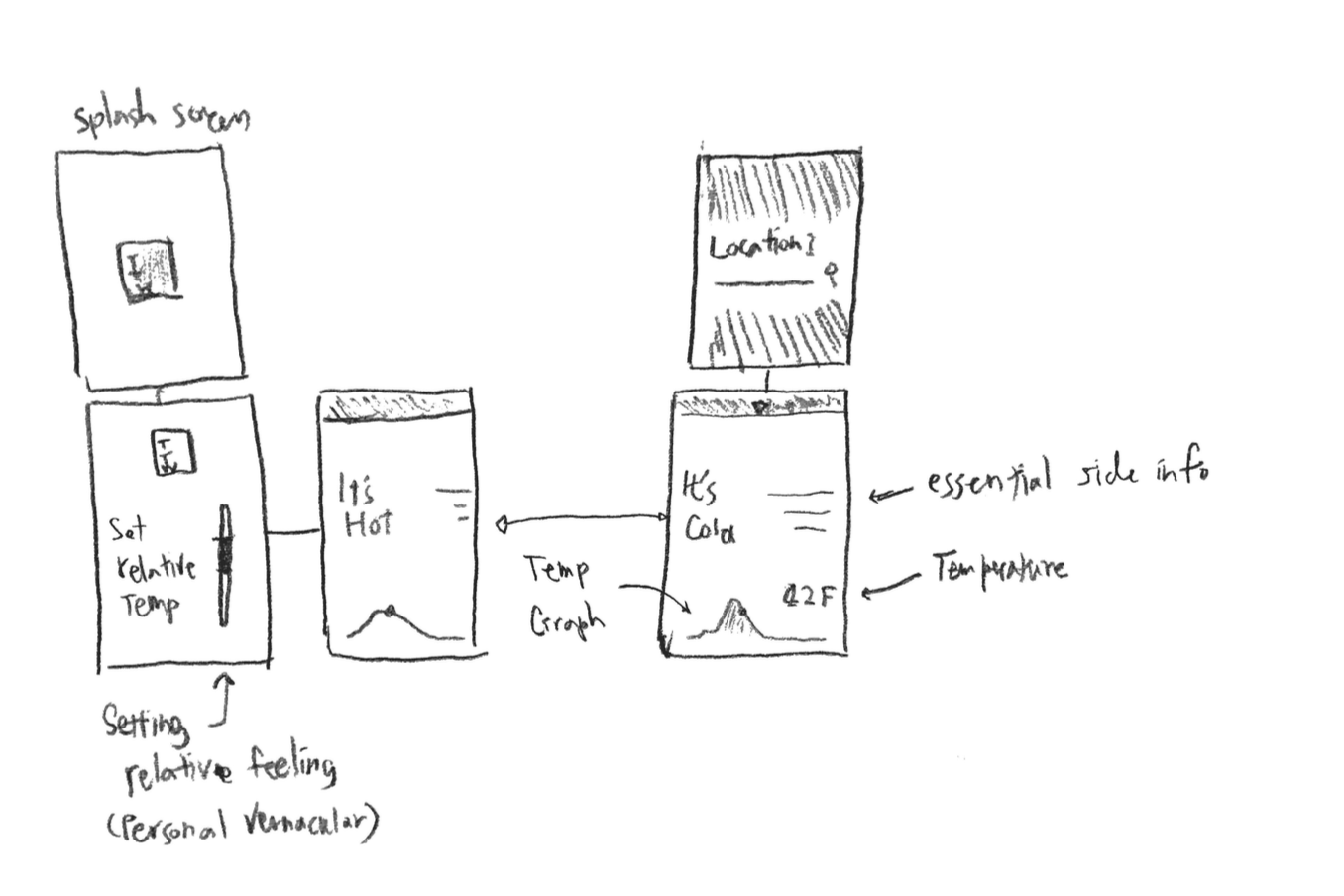
Rough sketch
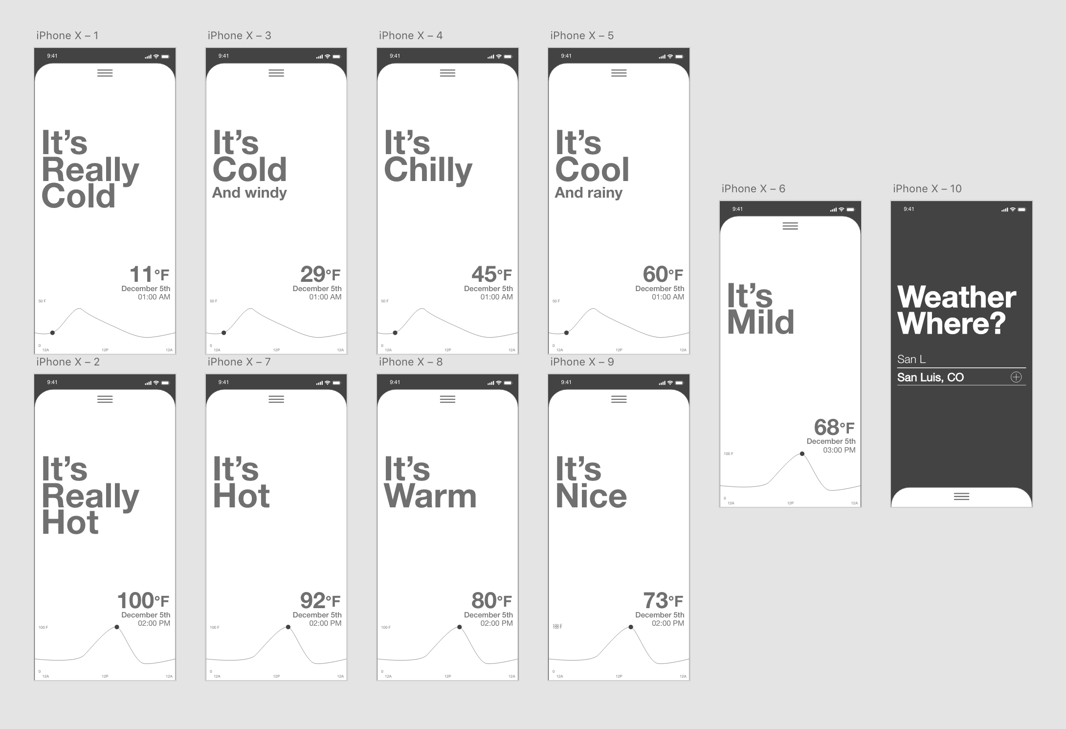
Rough Prototype in Adobe XD. The first wireframe included the basic elements of "Telling the Weather", graph view, date, and temperature and location screens you can add by sliding down the big 'card' interface.
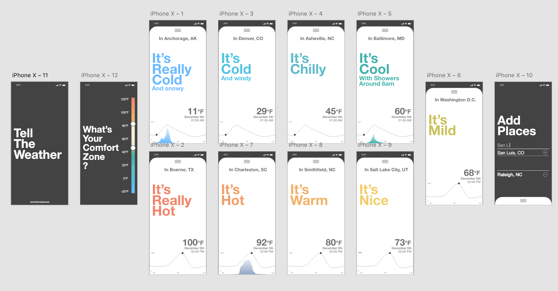
Based on feedback, location name was added and utilizing the card format, swiping side to side will give users ability to switch between locations.
Another splash screen was added to determine and customize what the user's comfort temperature zone is to adjust the language. Based on someone's geographic residence, experience, culture, or language those categories of description may not be accurate.
Overall, the language is conversational and human in its vernacular.
*Each weather information will be read out a loud each screen.
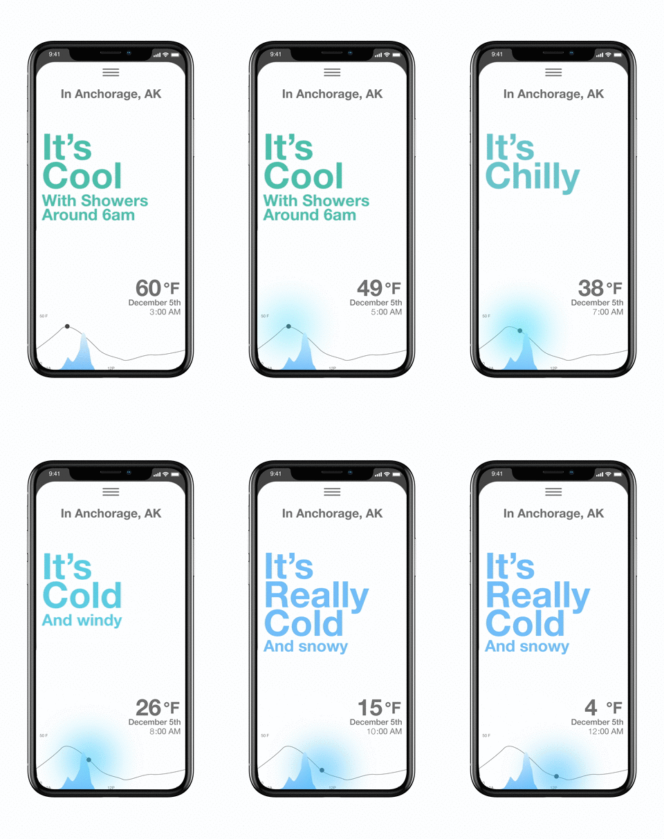
Scrubbing will preview the weather condition in the future.
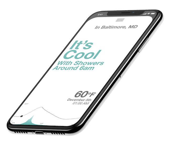
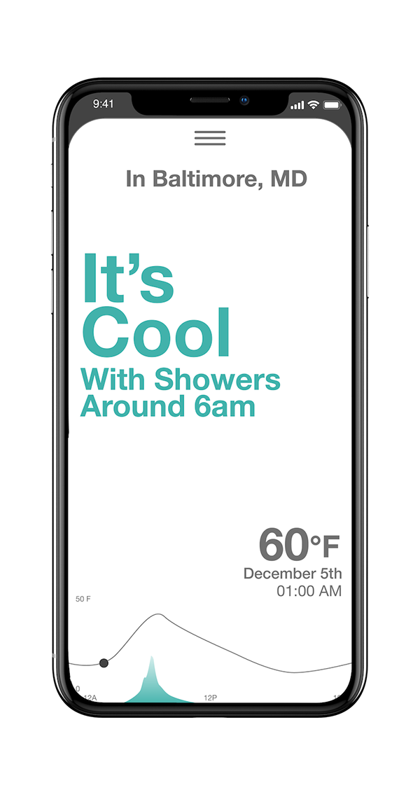
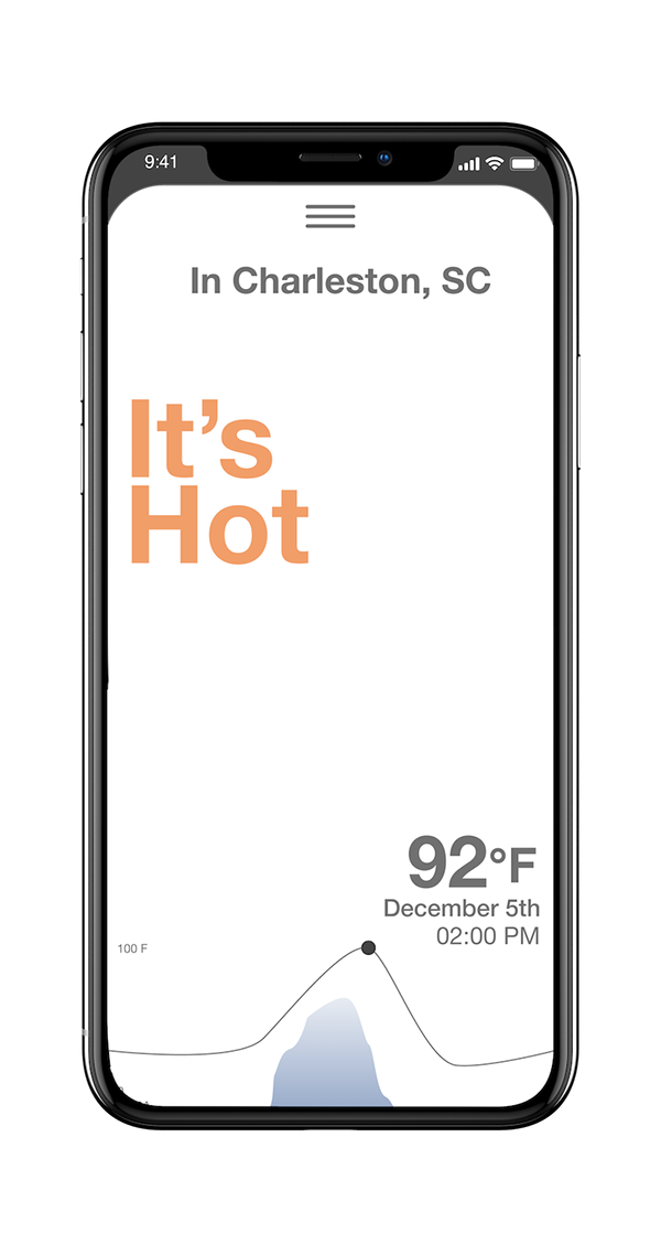
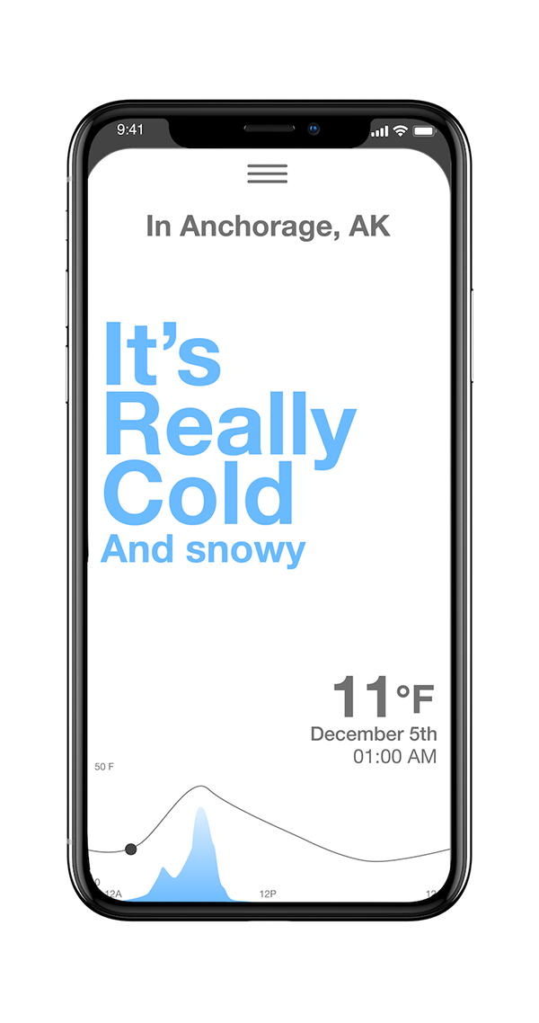
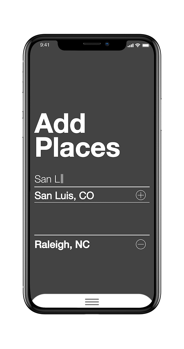
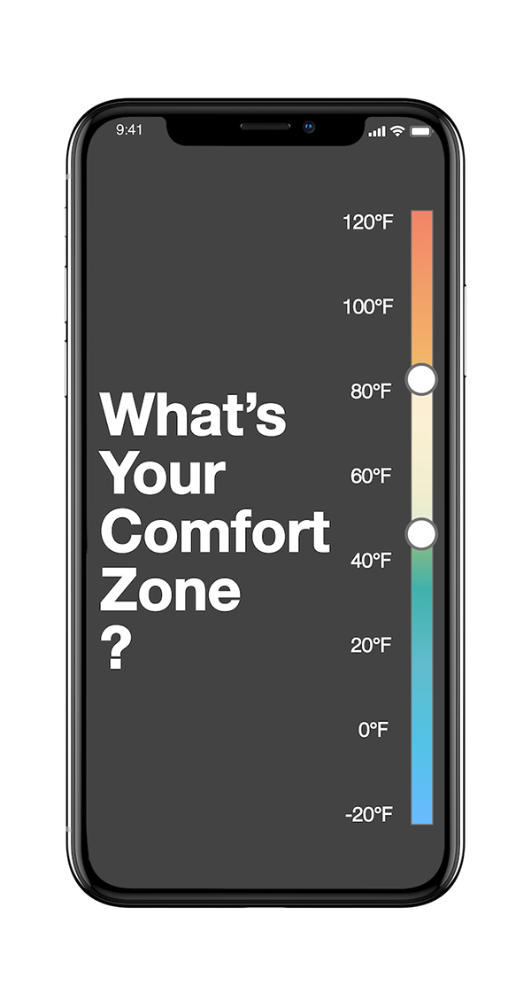
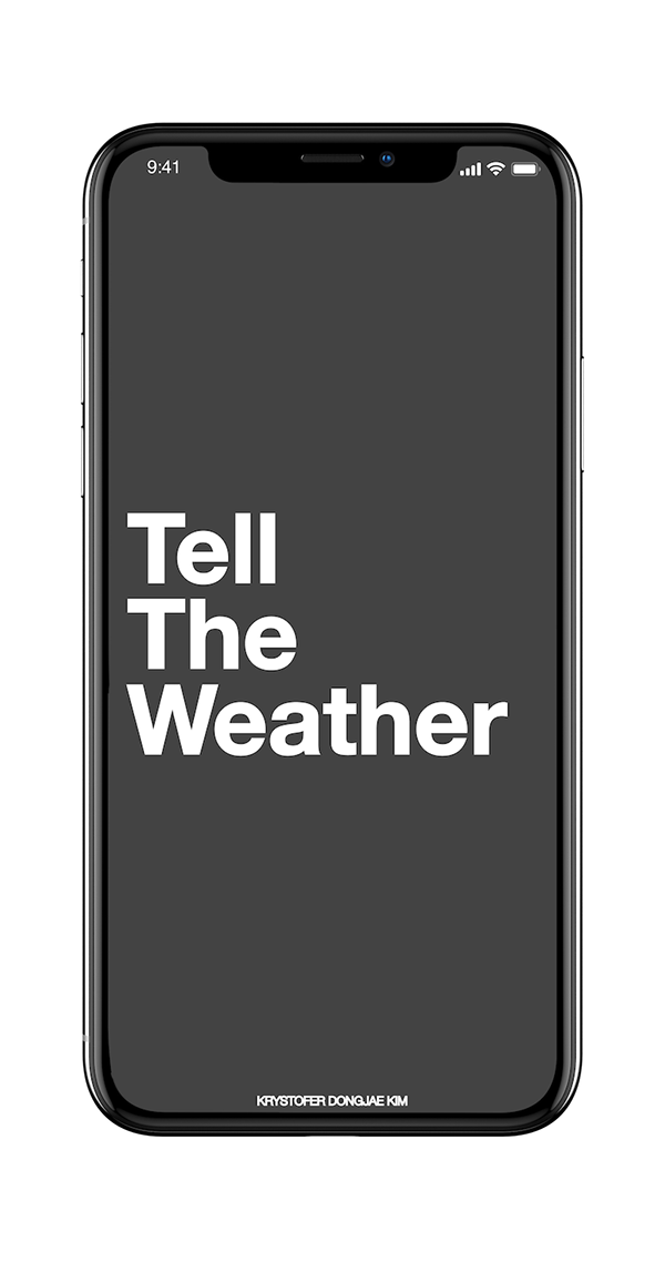
The weather screen acts as a card. When you swipe horizontally, it will scrub through future/past weather. If you flick down from the top of the tri-line logo, it reveals darker backend where you can customize settings.
Testing Feedback
"It feels less like I am using a device. It feels like I received a note from someone."
"I like that it feels clean and personal. And I hope it loads fast because of it."
"I hope the voice that reads the sentence,(which is the core function) can be customized to people. Like this can be in different languages and accents. That would make it feel more human."
Kryated.com
